

“Loro is a smart, caring, playful, cool, and personalized companion for wheelchair users, that can see, speak, listen and learn by artificial intelligence and machine learning. The system will be able to monitor users’ health status in real-time and provide reminders for medication and tasks. ”
Problem
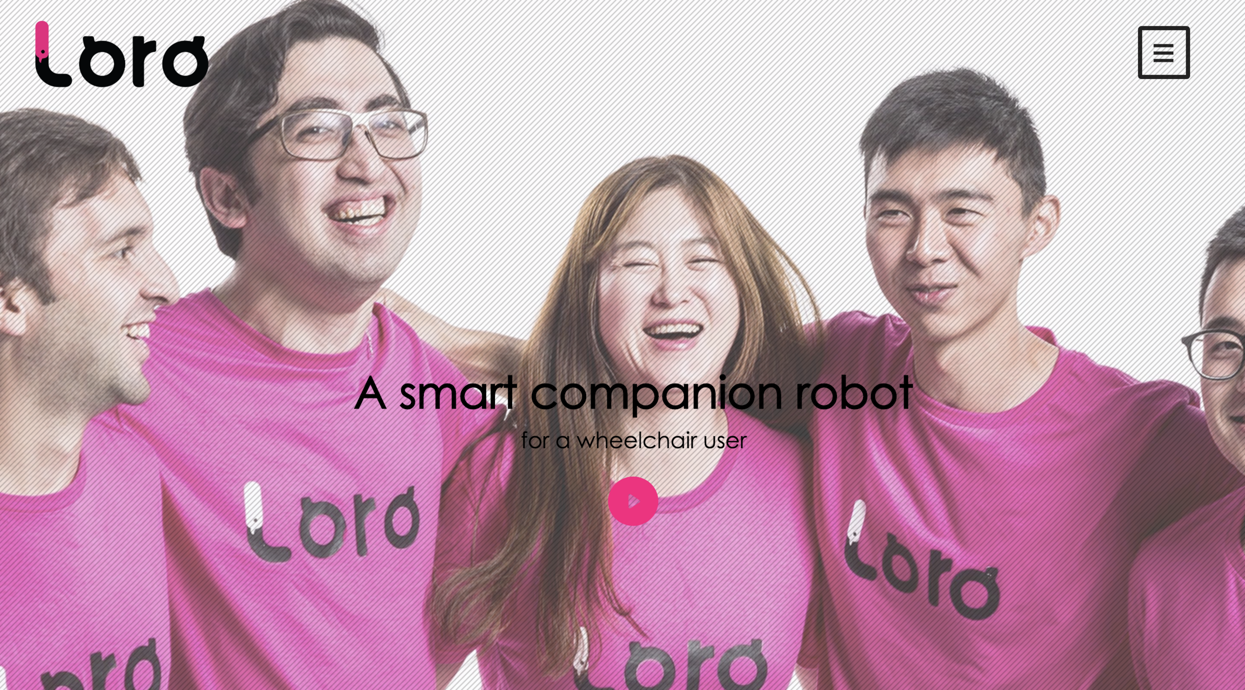
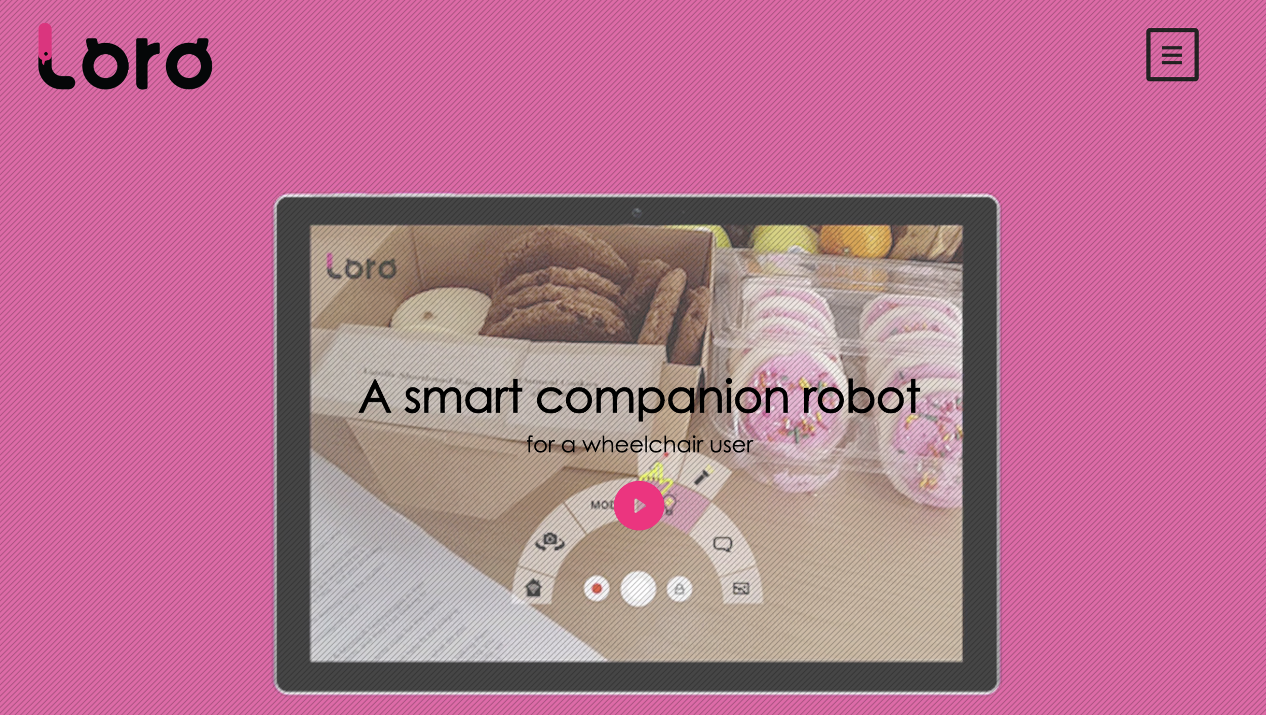
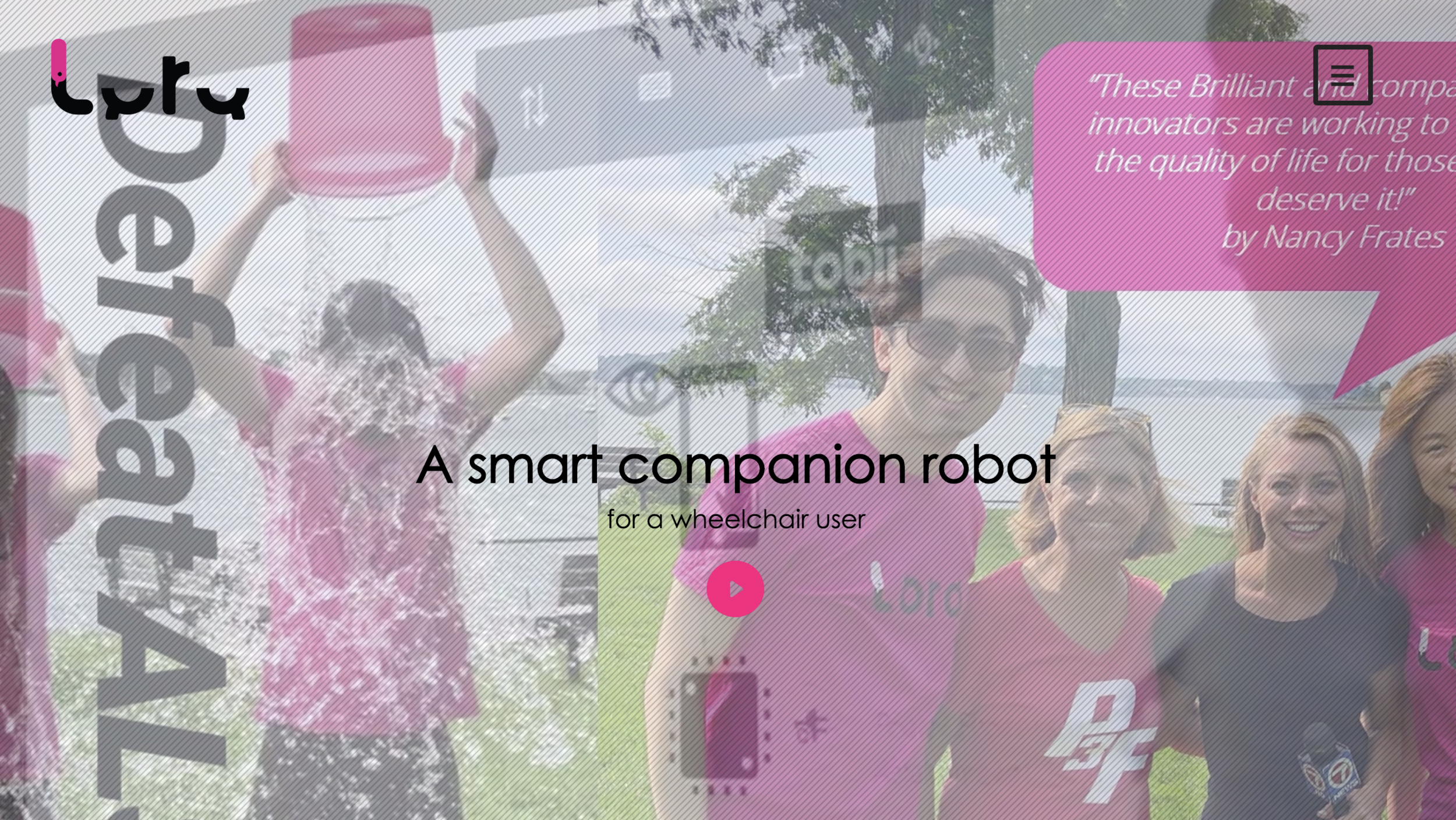
Website: Loro is in need of a compelling, user friendly and accessible website to sell their product.
Application: Loro needed a login and registration design in addition to an on-boarding process that will educate and direct users through its settings page
My Role
I was in charged of the visual design of both deliverables (Website and App).
I supported the research process conducting affinity mapping and card sorting.
Solution
Create a new accessible website in Squarespace that prioritizes information and improves the navigation experience of the potential buyers.
Create a delightful registration and on-boarding process for the app that guides users while their customize settings based on their needs.
Tools
•Squarespace
•Sketch
•Adobe Animation
•Principal
THE PROCESS
1. Research
Interviews
We tested the existing loro’s website with 7 participants. 6 wheelchair users and 1 physical therapist.
why
Understand the challenges potential users faced while interacting with Loro’s website, and identify what kind of information they were expecting to find.

We concluded that the users:
•Felt frustrated when trying to find information on the existing webpage.
•Found difficult to understand what was the product about.
•Wanted to know if the product fits their needs.
•Needed to know about cost, dimensions, adaptability.
•Wanted to see reviews and compare with similar products.
2. Synthesize Research
Why
Affinity mapping
Identify the information people needed to find in the web site.
After collecting all the information by in person interviews and a survey we organized and categorized the information conducting affinity mapping.

The majority of assistive technology seekers wanted to know:
•Cost, including insurance coverage and financing options
•Product information, dimensions, specifications, description
•How to use the product, set up, how to use with other devices, adaptability and customization
•Video Demos
•How to know if the product is right for them
why
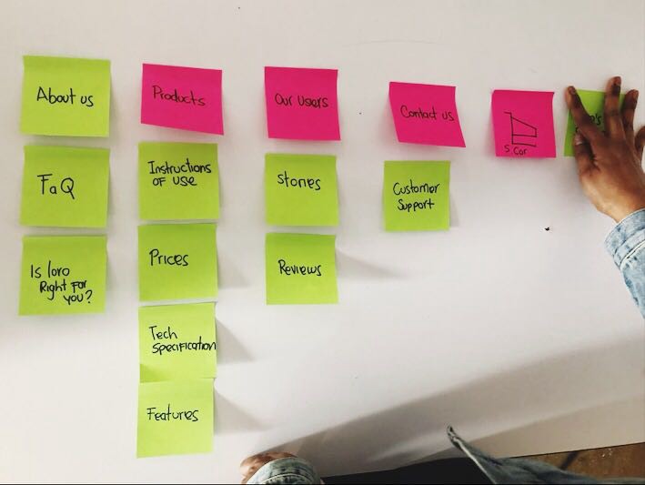
Card sorting
To create the information architecture of the website and select the best layout
After identifying all the information the web page needed to include, we conducted 5 rounds of card sorting with different people
3. The user
Why
Persona
To design our final products with an specific user in mind, that focus in his needs and pain points
Based on the people interviewed, we created 1 personas with the characteristics and pain points that fits the needs of our ideal user.
why
Journey map
Identify the feelings and touch-points of the user with the brand and visualize her experience.
We created a scenario were the user is trying to buy a new assistive device with the current web site
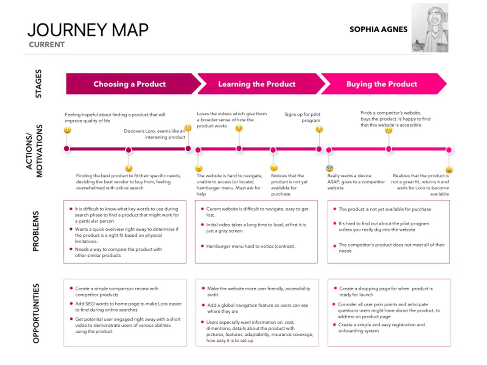
The current customer journey has a lot of pain points, as the original site is not very accessible. During usability testing on Loro’s current website user’s were confused about the hamburger menu, had difficulty seeing text and icons due to limited contrast, and found the website difficult to navigate. There also seemed to be 2 different home pages.
We focused in making all functionality available from a keyboard and creating a simpler layout that prioritized content
4. Website Wireframes
Current website
• There is not visual information about what is the product
•The hamburger menu is not accessible.
•The logo was a gift, which was very distracting.
•Lack of information like dimensions, weight and cost
why
Paper prototypes
To explore different layouts and to test out how it would flow by clicking through our prototype
We sketched out wireframes with different layouts and shapes

Wireframes

5.Prototype
During this process we did not have access to the product. We took the images from the current website and then we edited them with photoshop. We also created infographics with illustrator
On-boarding and Settings for mobile APP
6. The App: Tablet
We wanted to make sure the on-boarding process was simple, delightful yet informative in educating users about the device’s features. The ability to customize setting based on individual needs was also vital. We researched the iPhone’s accessibility settings, among other apps, to determine the best way to guide the potential user through this process. We focused on color blindness adaptability, vision, touch and hearing adaptations.

why
Paper Prototypes
To look at different options and select the best idea. It also helped us to make sure we were designing with our user in mind.
We explored different layouts. We were designing for a tablet app, but it also was going to be used in cellphones.

At the same time of the sketching process, we worked on an introductory animation, the idea was to show in an interactive way the parts of the product before the sign in process
7. Prototypes
The client also requested us to make recommendations about what kind of animations they could include to make the app more attractive and interactive.
Animation for on-boarding app

Prototype of registration process and settings

Animations proposals

8. Next steps
During our presentation to the stakeholders we recommended the next steps would be to:
To test the website and app digital prototypes with participants in their pilot program.
Add their content to the website based on what user’s most want to know, including product dimensions, weight, adaptability and cost.