“Understanding the challenges that summer camp registrants face in the registration process and identifying possible solutions.”
Problem
DPR uses first-come-first-served (FCFS) system for the summer camp registration. Spots fill up very quickly after registration opens because of high demand. DPR needs a research which support that changing to a lottery system would be a better option to improve the experience in summer camp registrants.
My Role
Visual lead
•Translate the researched information in to visuals, that generate impact and an overall understanding about the problem
•Developed customer journeys for the current and future states.
•Design of small changes in the registration website
Solution
Designing a registration process that will minimize stress, manage frustration and provide an equitable system where people do not feel left behind. In this respect, we offer a 2-staged solution:
•Long-term strategy: Switching to a transparent and well-communicated lottery system.
•Short-term actions: Making quick and small changes in the registration website to improve the online registration experience.
Tools
•Illustrator
•Sketch
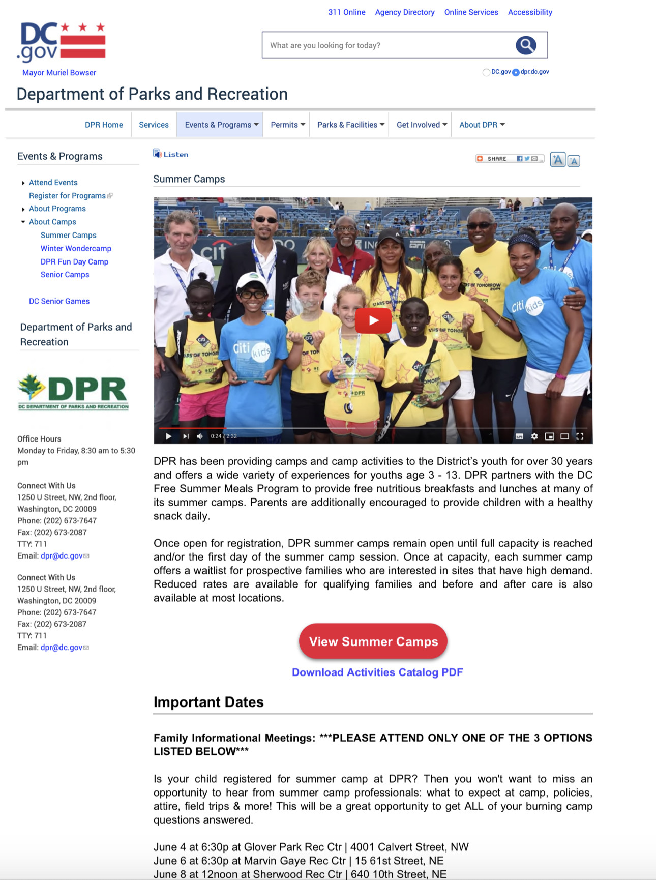
the summer camp registration
User Research
To explore the experiences of DC residents with the Department of Parks and Recreation in Washington DC, the team conducted 18 interviews with parents and non-parents to understand feelings & thoughts towards both FCFS & lottery systems and to listen to their experiences with both systems.

Affinity Mapping
After recollecting all the thoughts about DPR and similar organizations. The team did an affinity mapping. It helped us to organize, classify and understand all the information.

4 major insights

We concluded that:
•The institute has a reputation of being slow and unfair.
•People prefer systems that give them control.
•People want a transparent system.

It is obvious that there will be always some people unhappy or frustrated because of the placements.
Then, the goal should be to minimize stress, manage frustration and provide an equitable system where people do not feel left behind.
Persona
Based in the user research, we created a persona. It helped us to visualize and create a context for the possible solutions

USER JOURNEY and storyboards
Putting all these experiences and feelings together, we wanted to visualize our persona Michelle and compare how her journey looks like in the current system and how it would look like if the lottery system were implemented.


Journey Map and Storyboard if the lottery system were implemented
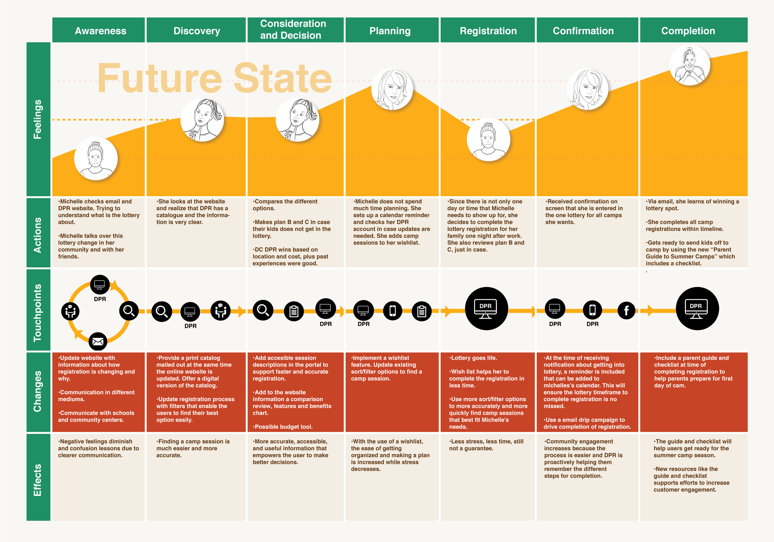

We concluded that:
Michelle feels more positive during the course of the future state, especially in Discovery, Consideration and Planing phases. She also finishes her journey in a more positive level in future state. As a result, if the lottery system is implemented as in the future state journey map, the user satisfaction will increase.
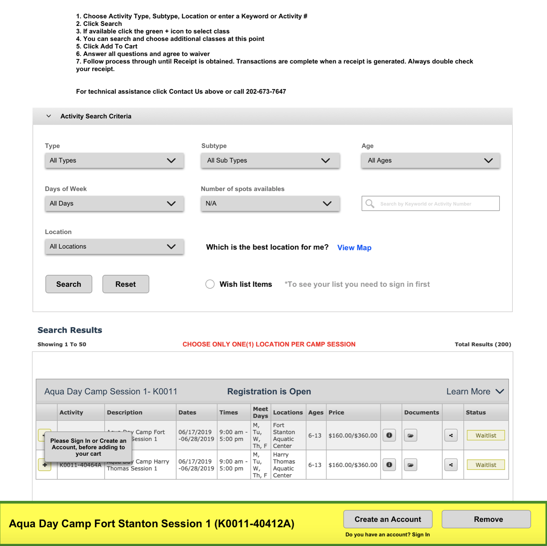
ONLINE registration SYSTEM
“LITTLE CHANGES THAT CAN IMPROVE THE EXPERIENCE”
the client had a rigid technical system. They were clear at the beginning expressing they won’t change their current website. We were not allowed to push its limits, so we had to be realistic about what could be done by within those limits. Therefore, we had to provide some pragmatic, functional and easy-to-implement recommendations.
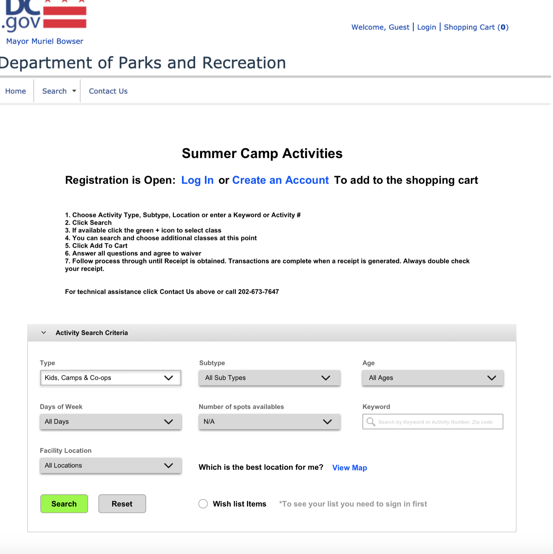
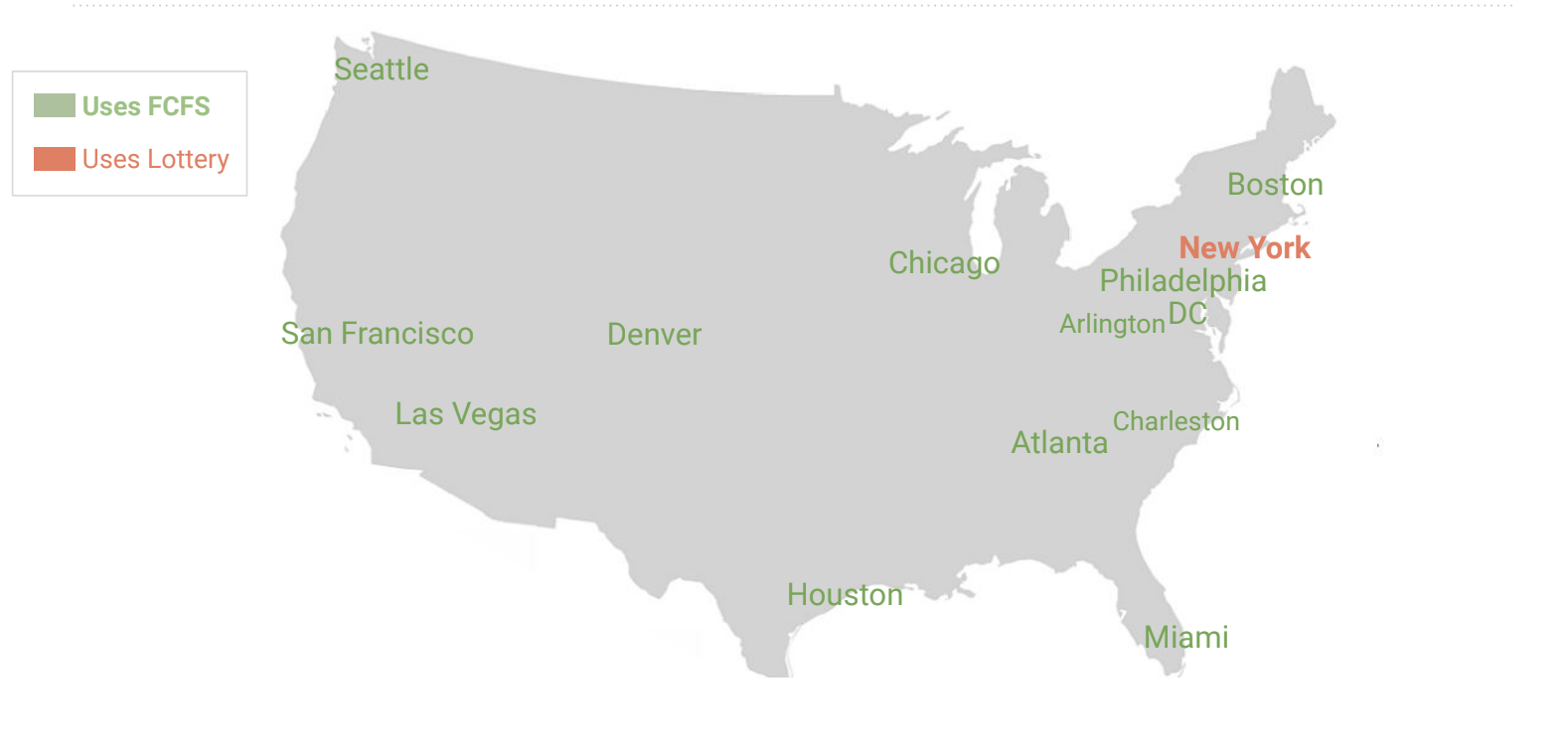
COMPETITIVE analysis
Diving deep to understand other FCFS user cities was a necessity to find out shortcomings of DC. We included in our analysis the strongest examples based on their features and content .
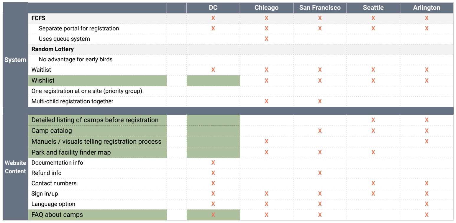
• DC does not have an online camp catalog or a detailed camp listing before registration, manuals / visuals telling registration process and a facility finder map.
•DC also needs a broader FAQ section.
•DC doesn’t have the wishlist feature
•DC doesn’t have clear “call to action” buttons
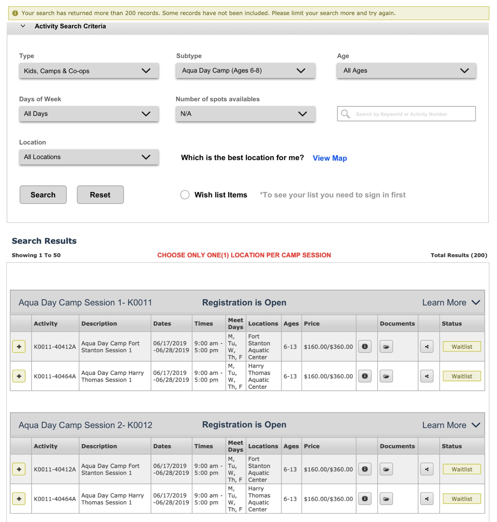
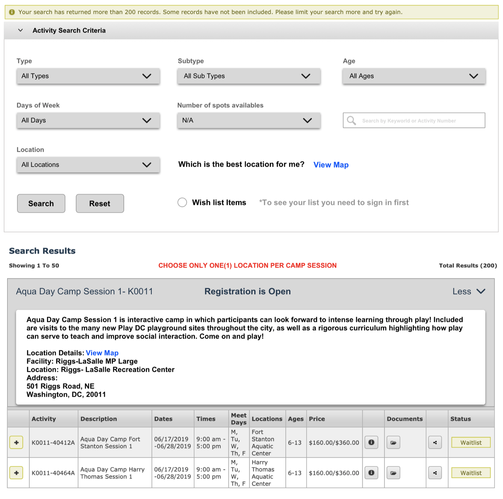
USABILITY TESTING

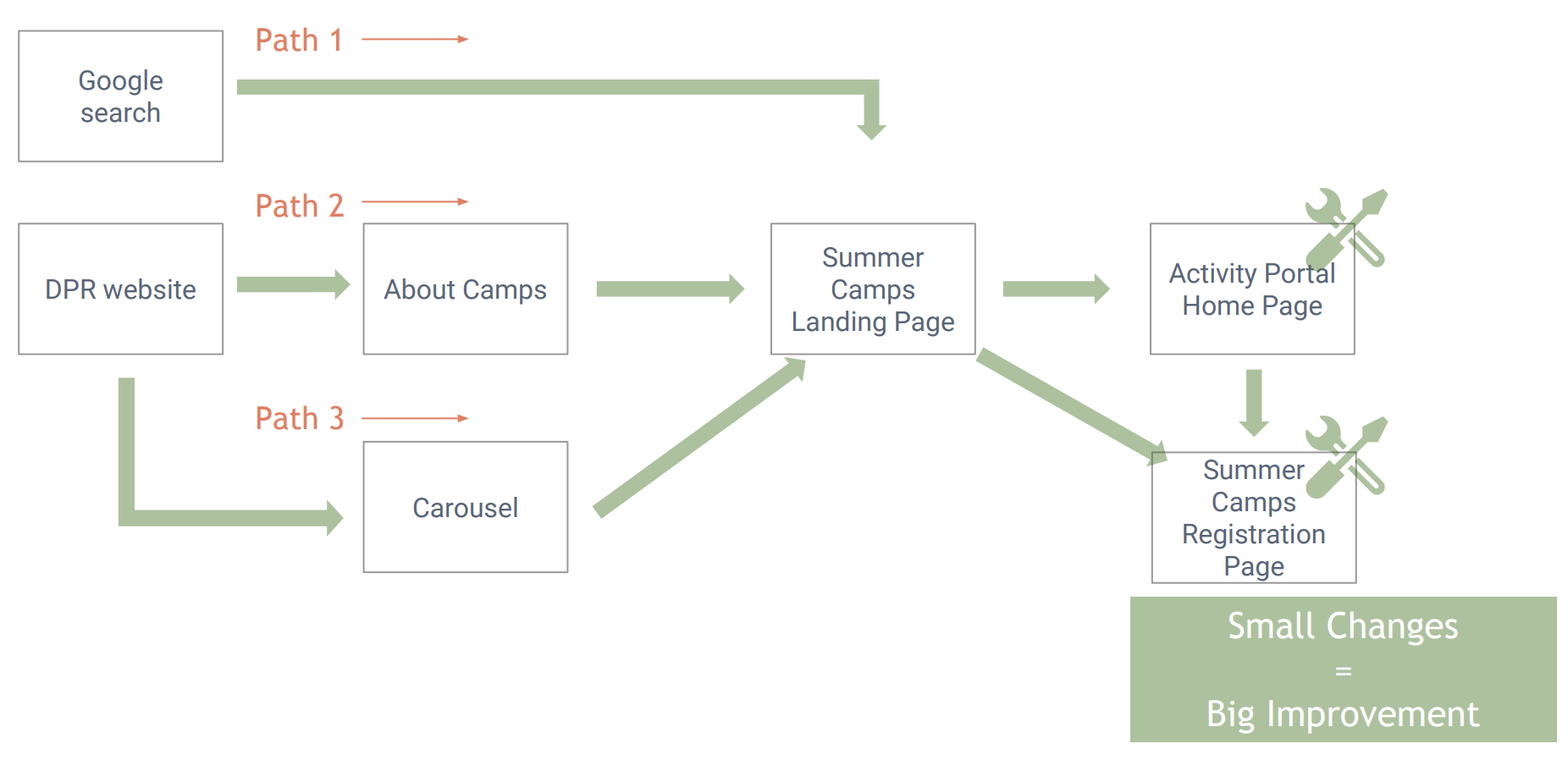
USER FLOW
We mapped out the user flow of the current registration process to locate the problems discovered in usability tests. This helped us a lot with the diagnosis of key problems.

potential improvements
CURRENT WEBSITE VISUALS

Recommendations
•Adding an online catalog and allowing users to visit the camp list before moving on to registration
•Adding clearer call to action buttons such as “View Catalog”, “Register Online”
•Cleaning filters to have a less crowded page
•Adding new filters such as zip code, number of spots available and wishlist
•Adding a facility finder map to see the exact locations
•Putting additional information in an expandable box
•Using clearer wording (such as view map) instead of using icons only
Changes implemented- prototype